SAP Fieldglass - Homepage Redesign
I led the end-to-end UX transformation of SAP Fieldglass’s homepage—a high-visibility initiative spanning product, engineering, and executive teams—reimagining it as a dynamic, role-based dashboard now adopted by over 1,000 enterprise customers.

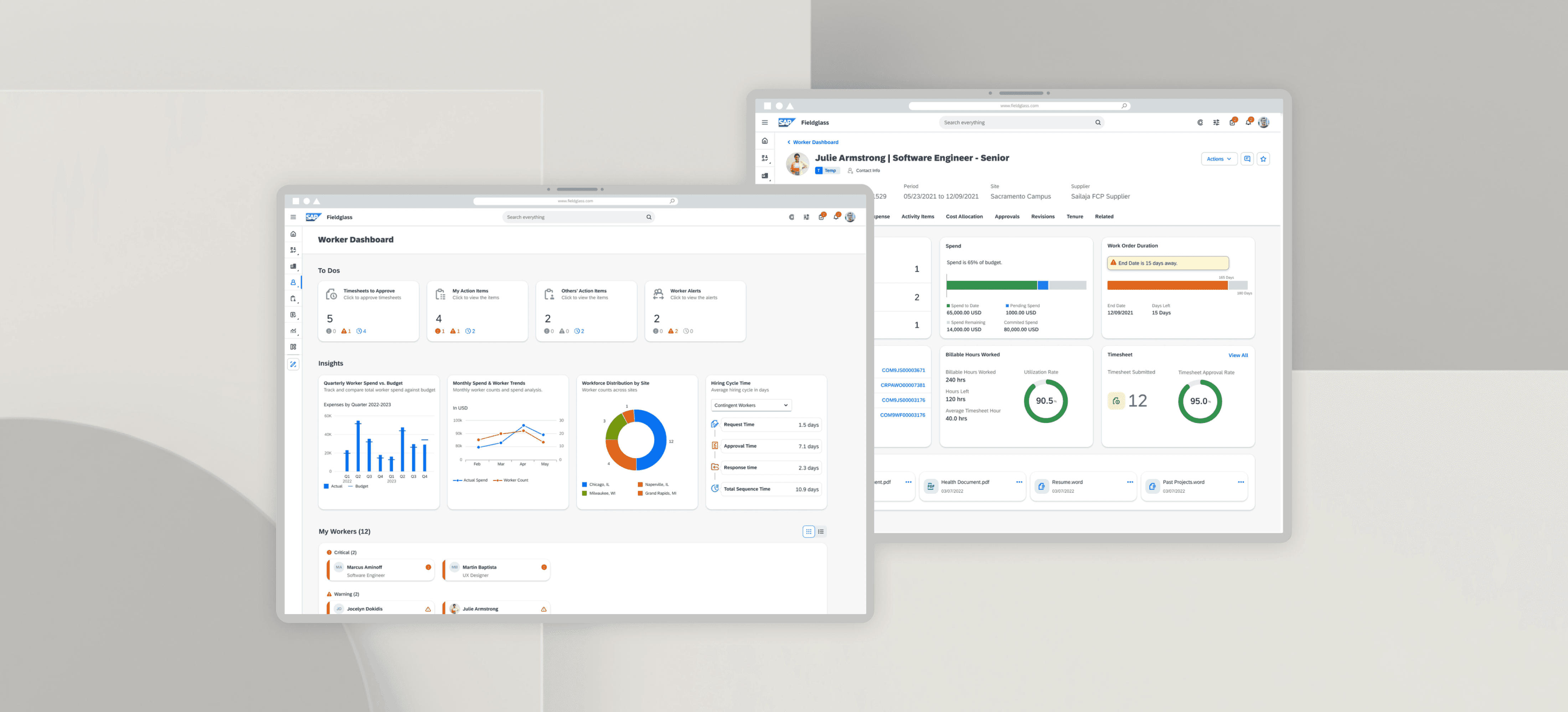
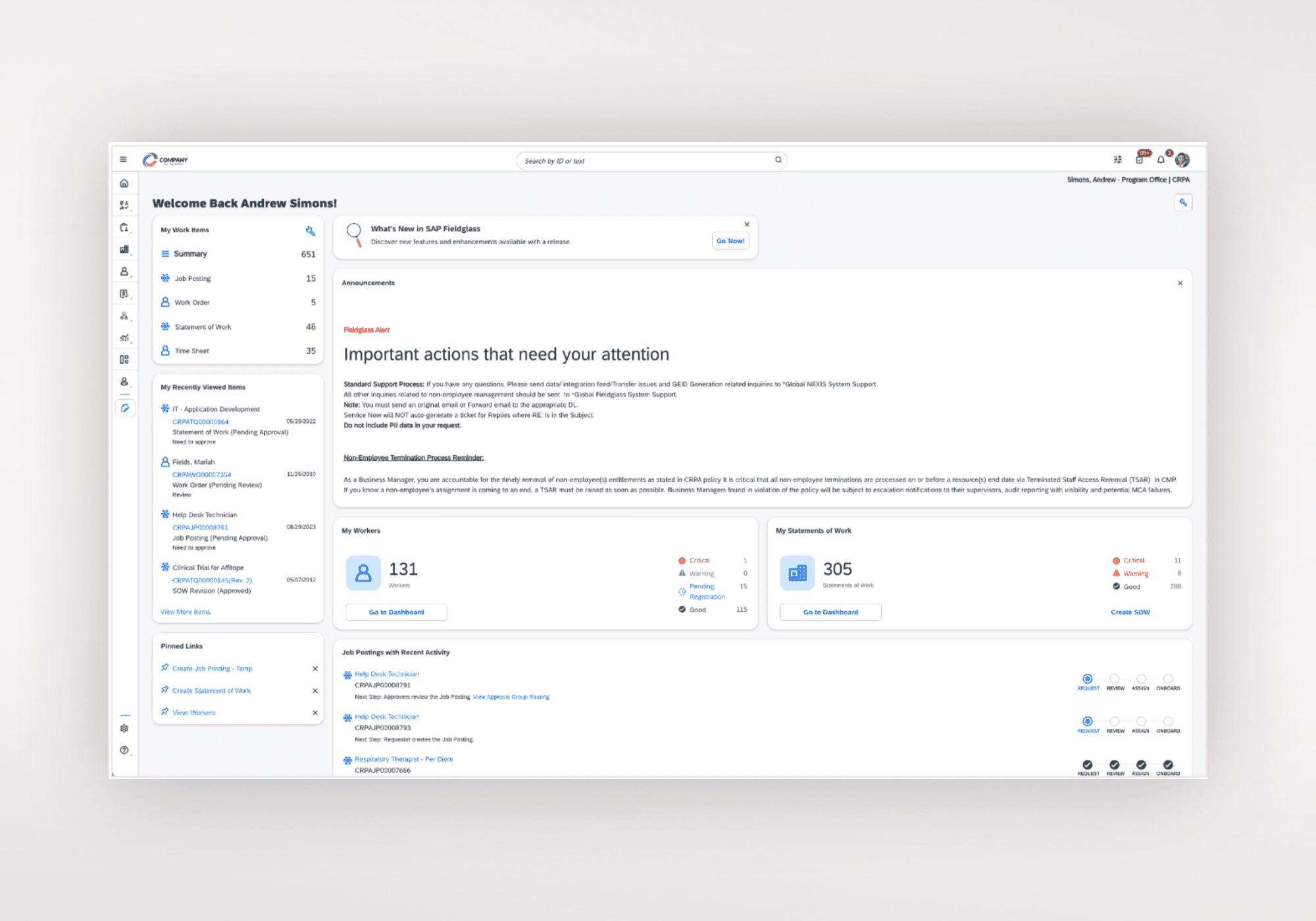
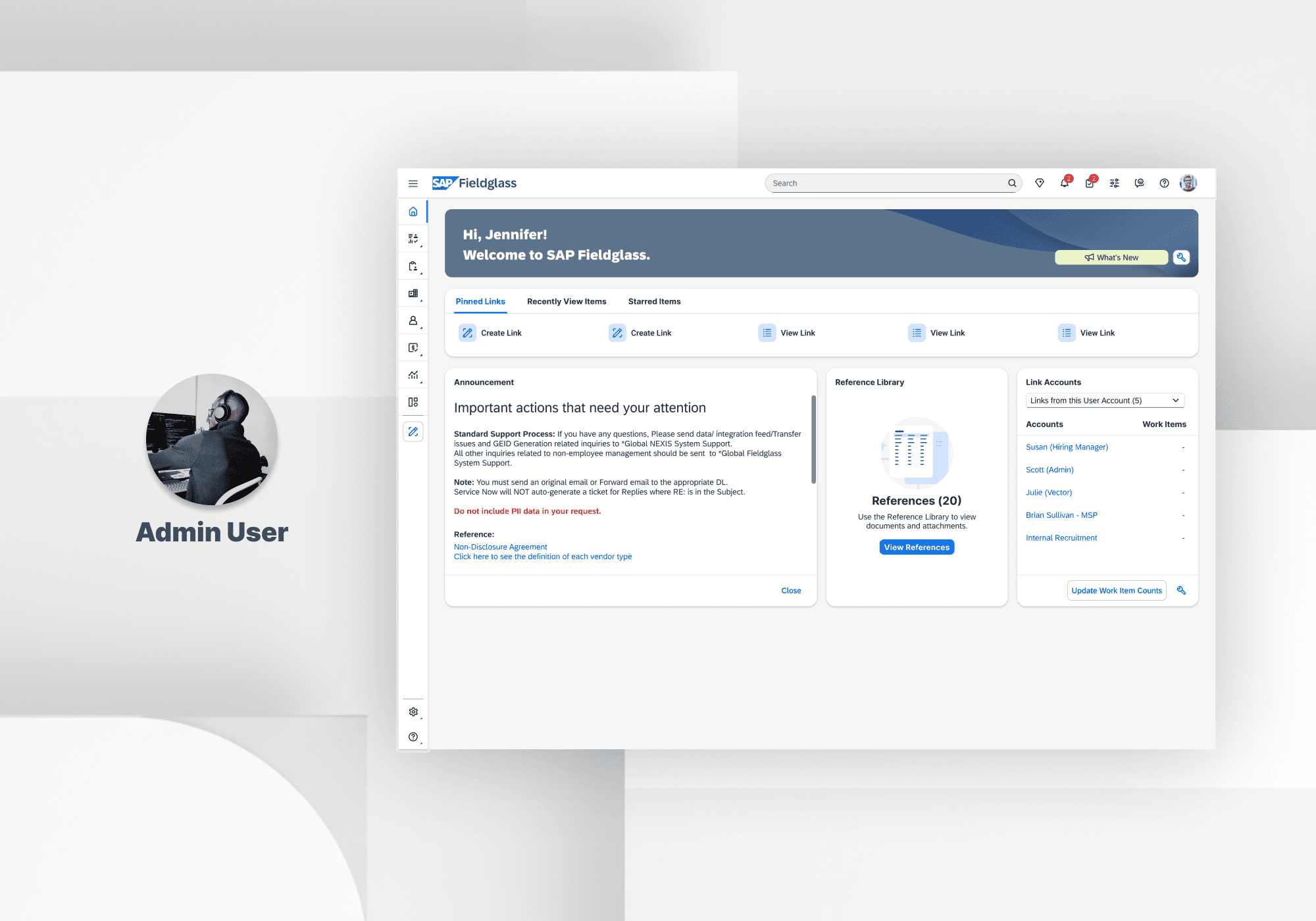
SAP Fieldglass is a mission-critical enterprise SaaS platform that empowers large organizations to manage their external workforce and vendor relationships at scale. The existing homepage had become a source of friction—users repeatedly reported it was cluttered, difficult to navigate, and failed to highlight their most important tasks.
In early 2024, I was tasked with restoring clarity and purpose to this key touchpoint.
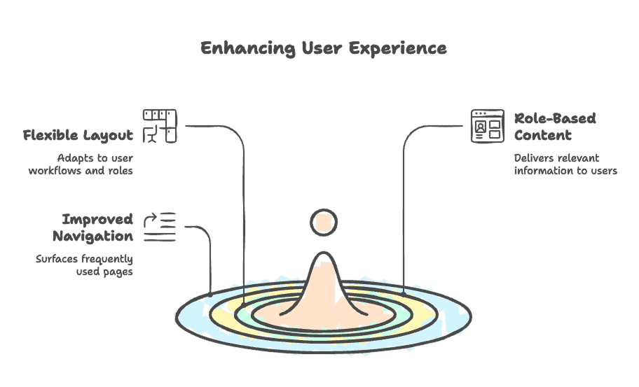
When leadership asked for a simple visual facelift of the homepage, I recognized a far greater opportunity: to turn this touchpoint into a strategic, user-centric launchpad. I defined three guiding pillars to reshape the experience end-to-end—then validated them through survey insights, user interviews, and cross-functional workshops: Flexible Layout, Role-Based Content and Job-to-Be-Done Navigation
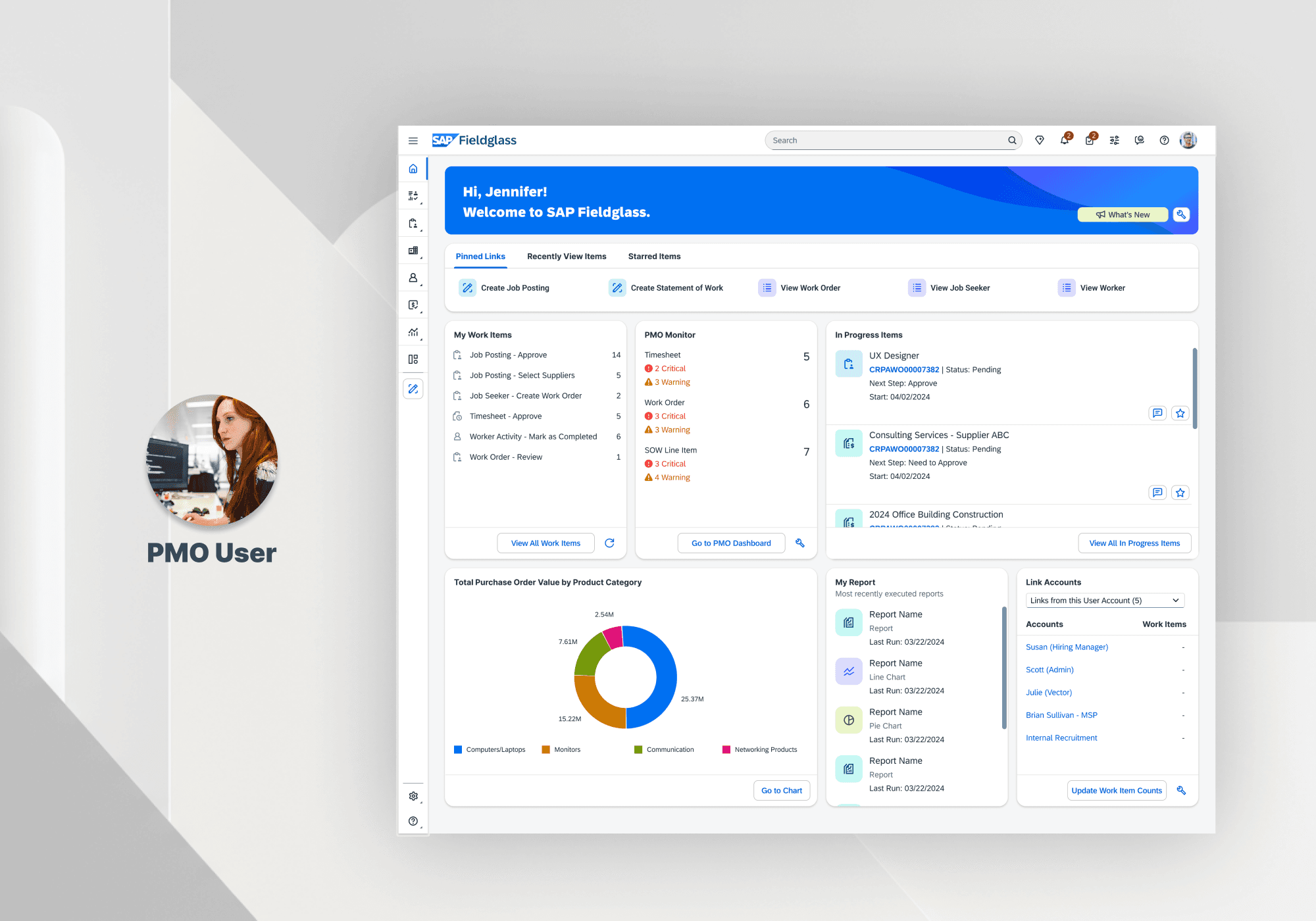
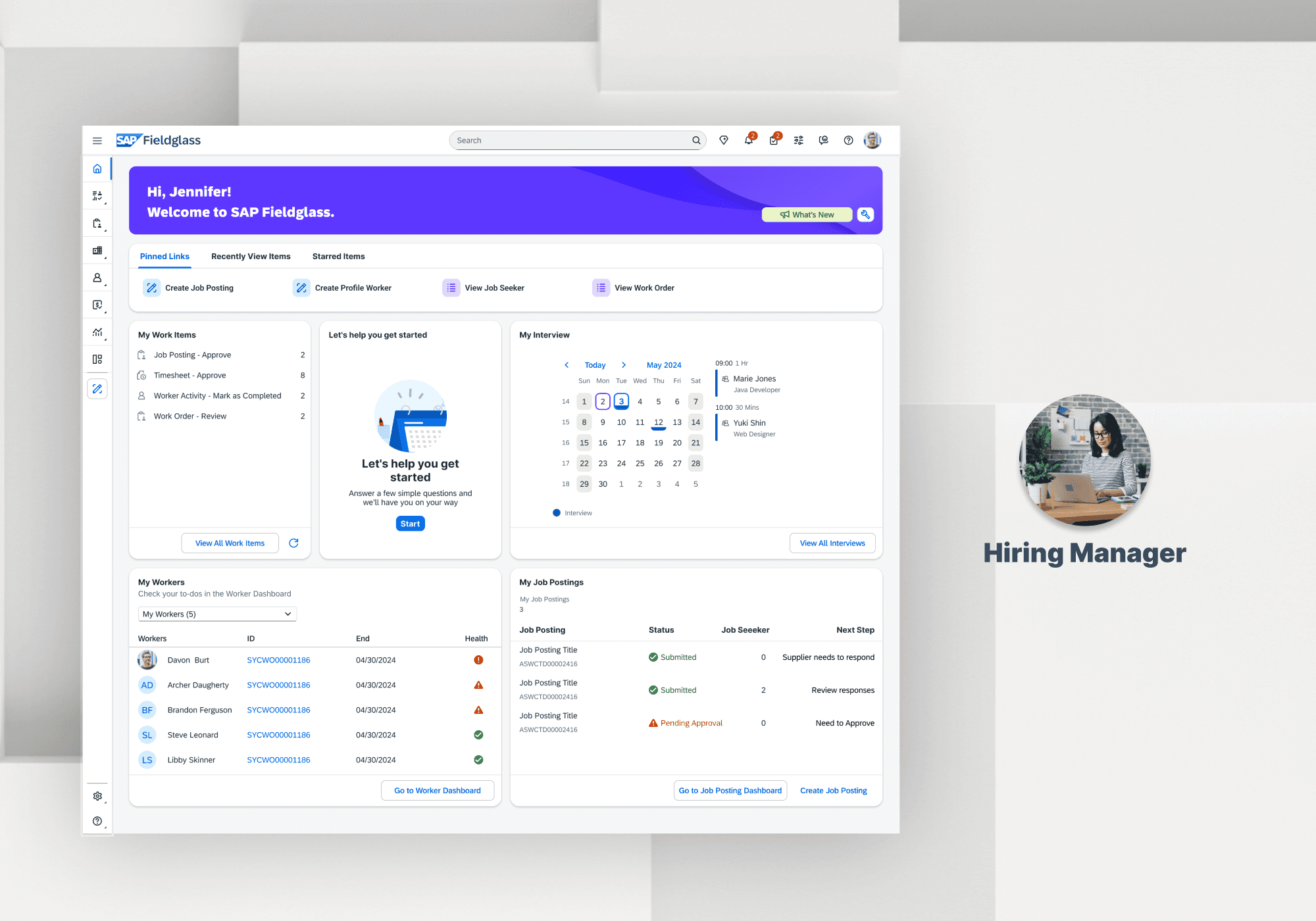
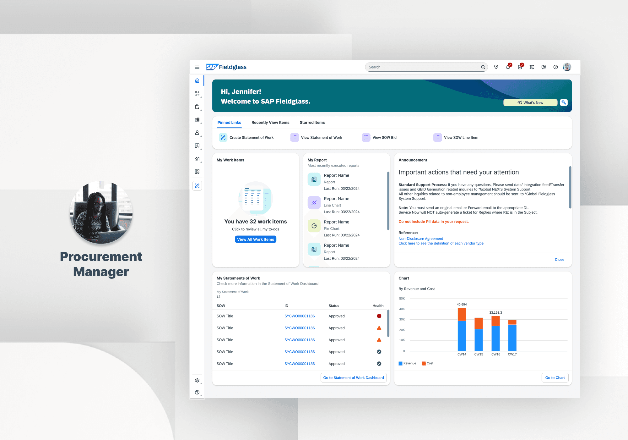
I proposed and built a template system tailored to four core personas (Hiring Manager, PMO, Financial Approver, System Admin). By mapping each persona’s top workflows to specific widgets and data points, we ensured every user sees exactly what matters most to their job.

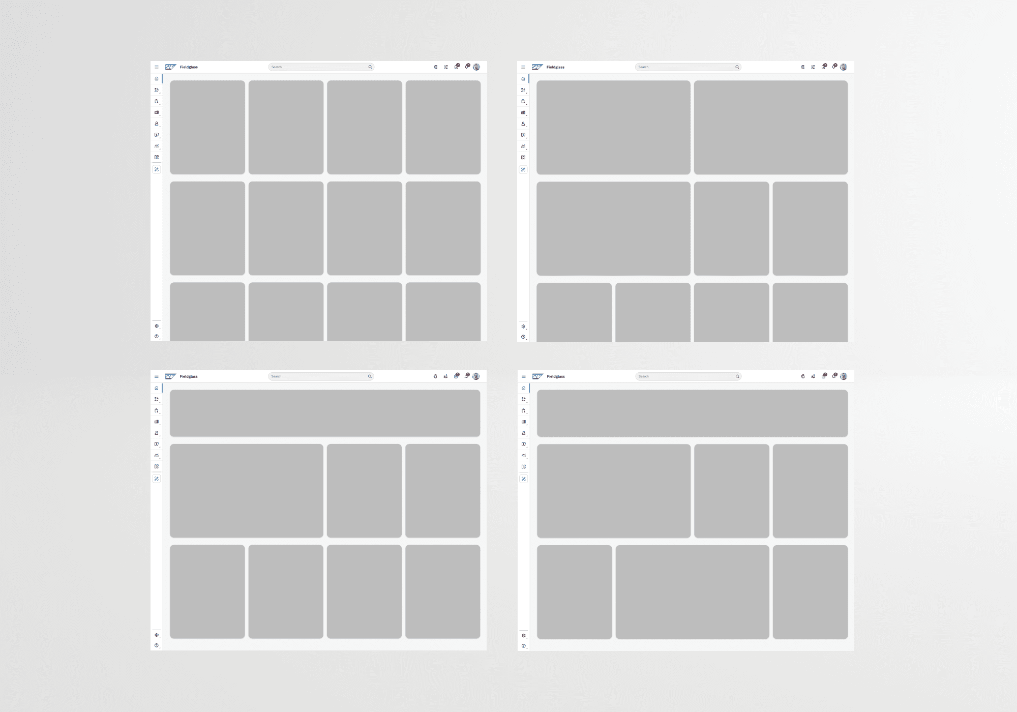
Rather than a static page, I designed a modular, four-column grid powered by SAP UI5 cards. This framework adapts to evolving needs, letting us introduce new widgets or reorganize content without a full redesign.
I led a full audit of homepage widgets, worked with our PM and researcher to map core user actions (e.g., posting a job, reviewing SOWs) and determined what information truly needed to be surfaced. This reverse-mapping allowed us to cut noise and prioritize action, transforming the homepage from a wall of widgets into a focused control center.
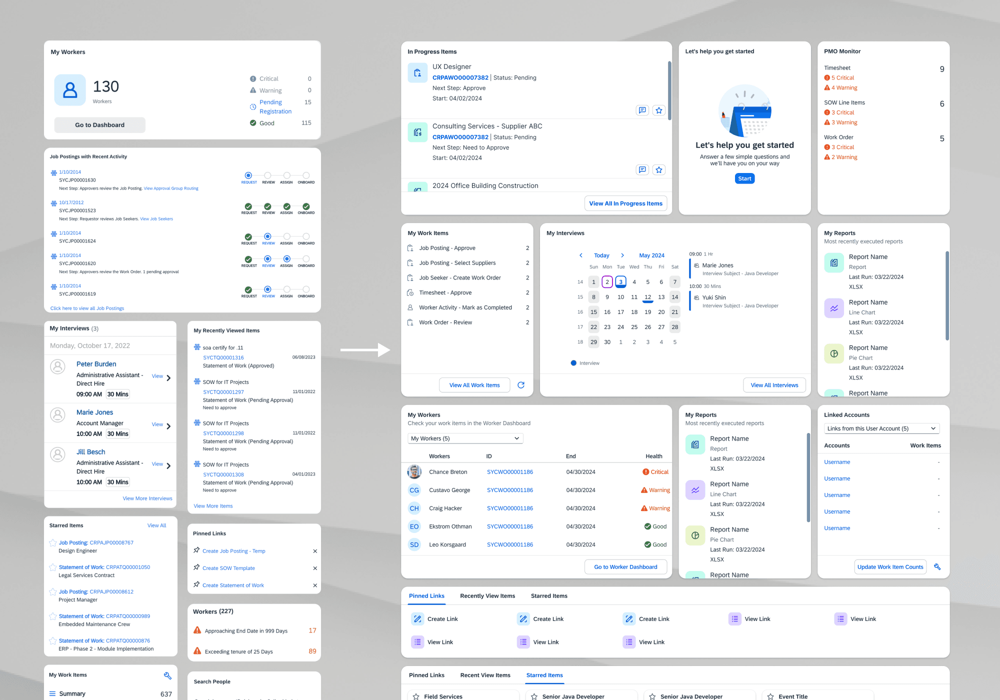
The redesigned homepage launched with a modular, adaptive framework that supports ongoing roadmap changes without major redesigns.

Trust through Transparency – show data citations, confidence, and fallback channels.
Progressive Disclosure – reveal complexity only when the admin asks for more.
System First – build reusable conversation + card components for rapid feature onboarding.
Outcome‑Aligned – measure every release against admin task completion and ticket deflection.
Business alignment turns design into growth—framing each feature in terms of ticket deflection made exec buy‑in easy.
Explainability is the new usability for AI: admins only trust answers they can audit.